Lifesong Canada
August-December 2021
Increased perceived reputability through the visual design of the Lifesong Canada website in order to increase number of sponsorships and donations
The newly redesigned Lifesong Canada website is available now with an all-new sponsorship experience still underway. This redesign required thoughtful brand strategy and design to build reputability and the user’s journey.

Branding refresh
Context
The branding guidelines that Lifesong Canada already had were lacking a lot of direction, so that was a project that we needed to tackle before handling the website.
Challenges
One of their primary concerns was building reputability. In order to try to inspire confidence in their brand they tried to use very cold, corporate language. While that might work for some brands, for an organization that is mainly concerned with the well-being of children, it came across as uncaring.
Goals
Soften the voice and visuals of Lifesong Canada, while maintaining and improving on their perceived reputability.
Solutions
Iconographic system
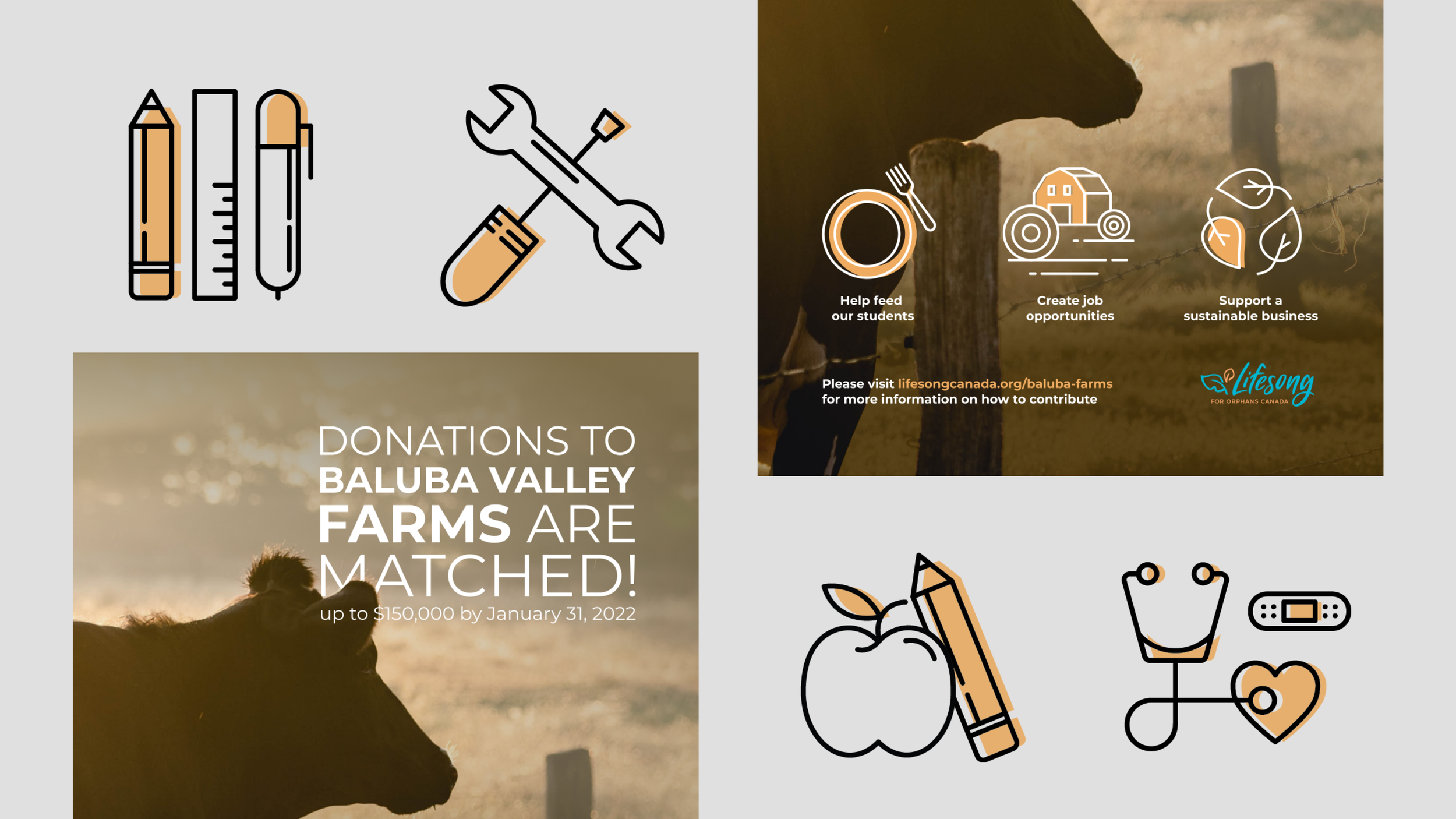
We created a simplistic iconographic system that was built using the colour palette in their pre-existing branding guidelines. We elected to have broken lines and off-set colour in each icon in order to capture a youthful feel since Lifesong Canada works exclusively with their school’s students in Zambia.
Emphasis on the children
Currently, their sponsorship page is less than ideal. Not only is the introductory text for the page a nightmare for users to navigate through, but the children are displayed with the ID number first, before their name. Nevermind that it doesn’t include any other important information like their age and how long they’ve been waiting for sponsorship.
Softening language
The language that they were previously using felt very cold and corporate. While that helps to add a sense of strength when growing your reputability, it does not translate too well for an organization focused on helping underpriveleged youth. As a result we rewrote the majority of the copy on their website.
LANGUAGE BEFORE
“Your sponsorship helps us to disciple our students.”
LANGUAGE AFTER
“Your sponsorship gives our students the confidence to use their voices and find their faith.”
Website refresh
Context
Lifesong Canada’s website is hosted on Squarespace so that their team can make updates as necessary, without requiring the help of web designers. However, their website was a cookie-cutter template from Squarespace that needed some help feeling more professional in order to entice more people to make donations.
Challenges
The website was lacking consistent branding across it, including using the wrong typeface. So in addition to having to fix elements like that, we also needed to restructure a lot of the pages.
Goals
Create a clearer path for users to navigate through the website, putting more of a focus on donations and sponsorship since that is the purpose of the website.
Solutions
Landing page restructuring
The landing page previously featured a slideshow of images of the students in Zambia, but in order to make the initial onboarding even more impactful, we opted to create a looping video of the students.
We also created clear CTAs for users, including making the sponsorship button in the navigation a bright orange from their branding guidelines.
Full restructuring
Once our direction with the landing page was reviewed and approved by the board of Lifesong Canada, we moved on with the full redesign of the website. Again, starting in Figma so that my partner and I could build off of the wireframes we created at separate times.
Addition of event pages and goals
One of the main goals of this website was to have it launched in time for their Baluba Valley Farms fundraiser. As you can see in the screenshot below, the new overhaul of the website and our respective social assets helped to bring in more than double the goal for the purchase of the farmland.
Conclusion
Results
As previously mentioned, the Baluba Valley Farms fundraiser was the perfect benchmark to see how effective our new website layout was at helping to build reputability for Lifesong Canada.
Reflection
Squarespace 7.0 as opposed to Squarespace 7.1 is a lot less fluid and it was unfortunate that Lifesong Canada wanted their website to be built in the latter. I do feel that despite our best efforts to transition our designs from wireframes to the web there were a few technicalities that we lost.
We did use a lot of CSS to restructure the overall website, but ultimately we couldn’t make the website too complicated as it needs to be updated by the team at Lifesong Canada who don’t necessary have experience with coding languages.


